 Over the last two months I have opened more than 200 pieces of nonprofit print materials and 95% of them are in the same format and structure of those that I was writing and publishing in the late 1990’s. Like press releases, print fundraising appeals and newsletters seem to be taking little account for the rise of social and mobile media and it’s effect upon how donors and supporters consume information. Information overload is real and 2-page front and back 12 point font fundraising appeals and text heavy newsletters just can’t can’t be making the same impact that they were a decade ago.
That said, I am years removed from publishing nonprofit print materials, but all communications and fundraising are evolving in response to the rapid rise of social and mobile media, so why not print materials? For those eager to experiment with new ideas, below are six examples of nonprofits pioneering new ideas in nonprofit print material design and formatting:
1) Less text and larger font.
The National Committee to Preserve Social Security & Medicare
Fundraising Appeal [16 point font]
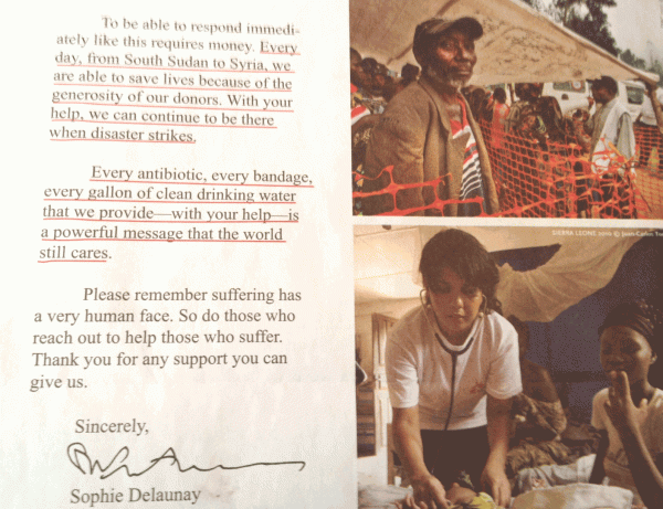
2. Large photos – and more of them.
Doctors Without Borders :: Fundraising Appeal [18 point font]
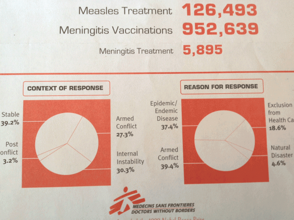
3. Use infographics.
Doctors Without Borders :: Fundraising Appeal [18-30 point font]
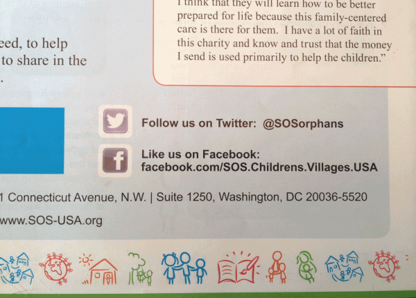
4. Integrate social media.
SOS Children’s Villages :: Newsletter
Only 3% of nonprofits incorporate social media into their print materials.
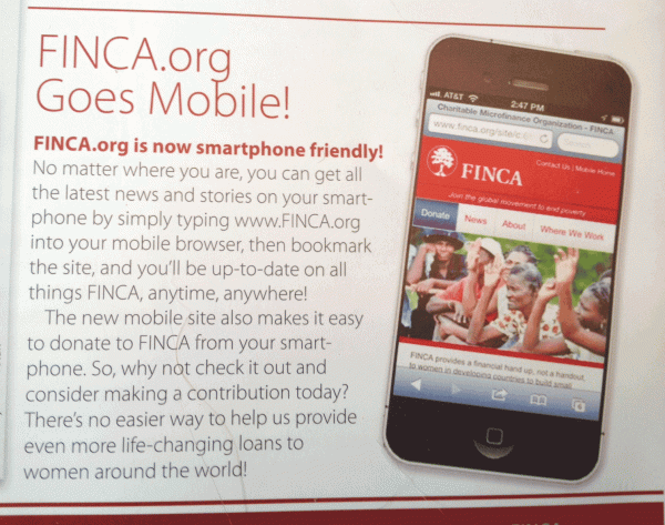
5. Integrate mobile media.
FINCA :: Newsletter
Only 2% of nonprofits incorporate social media into their print materials.
If your nonprofit accepts text donations, add your short code and keyword pitch.
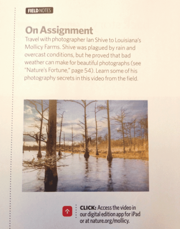
6. Incorporate video.
The Nature Conservancy :: Magazine
Related Link:
Social and Mobile Media Webinars for Nonprofits

